
Canvas#
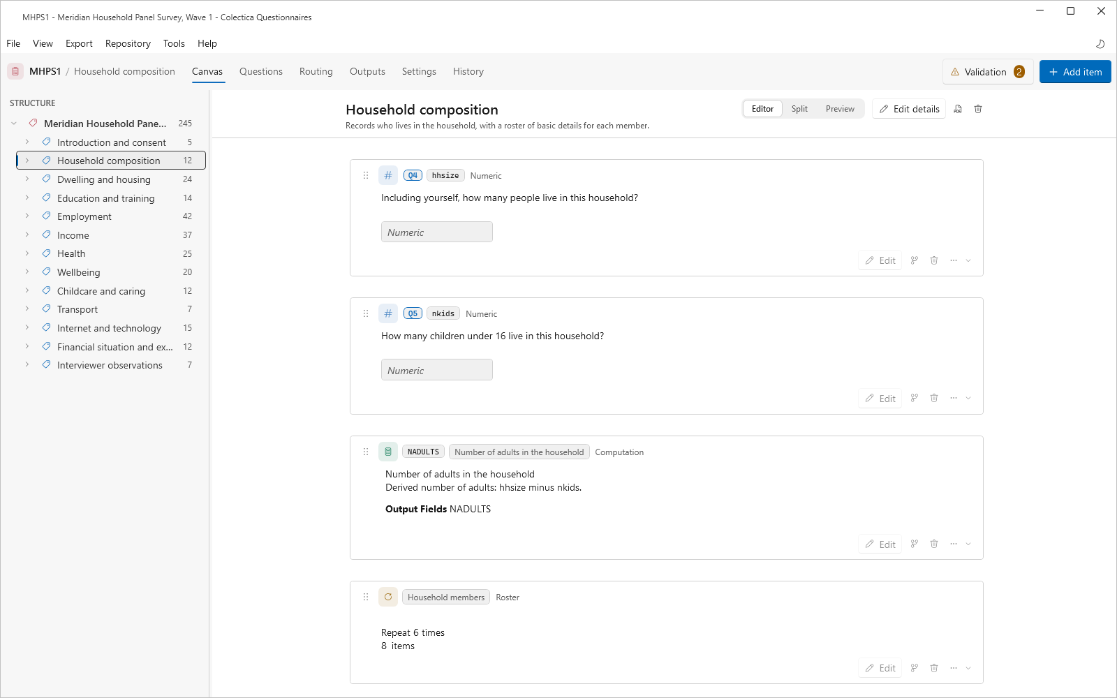
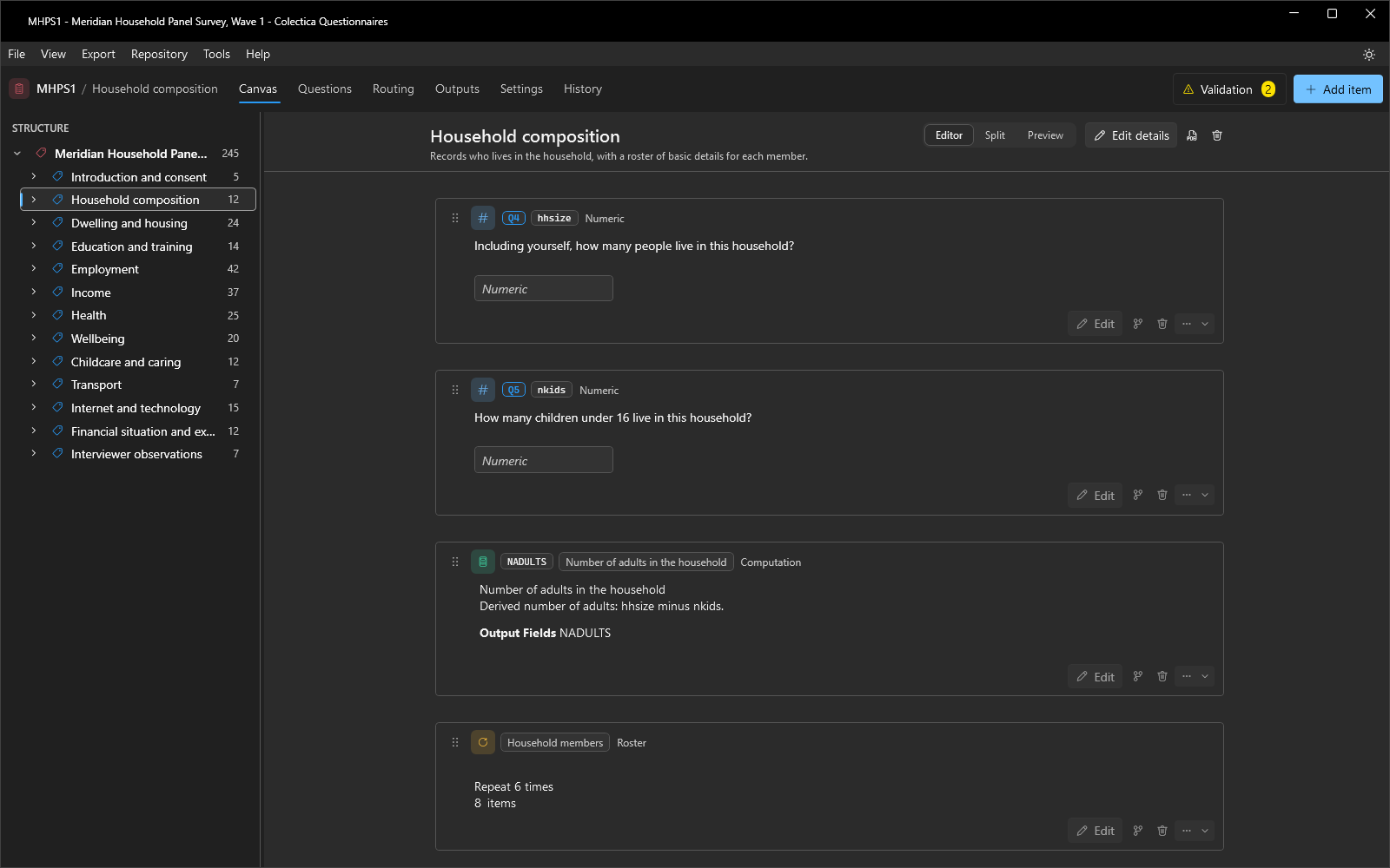
The Canvas is the design surface where a survey is built. It has three areas: the structure tree on the left, the card canvas in the middle, and, when enabled, the live preview on the right.
The Structure Tree#
The Structure tree shows the whole survey. Each row shows an item’s type icon and label, and a question’s row also shows its number; sections show a count of their descendants, and conditional items carry a branch badge. Selecting a row opens that part of the survey on the canvas and scrolls the matching card into view. Rows can be dragged to reorder the survey.
The Survey Overview#
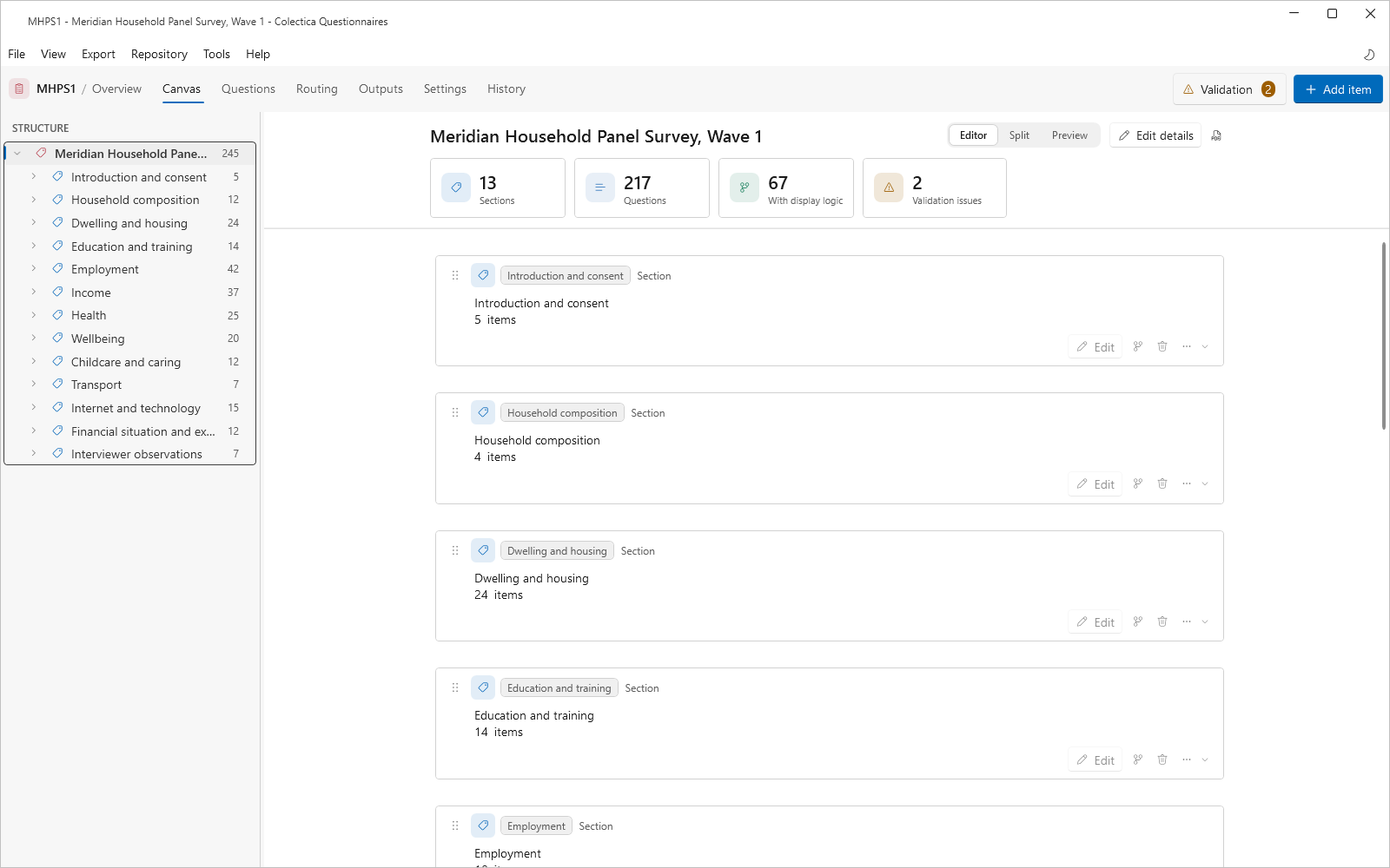
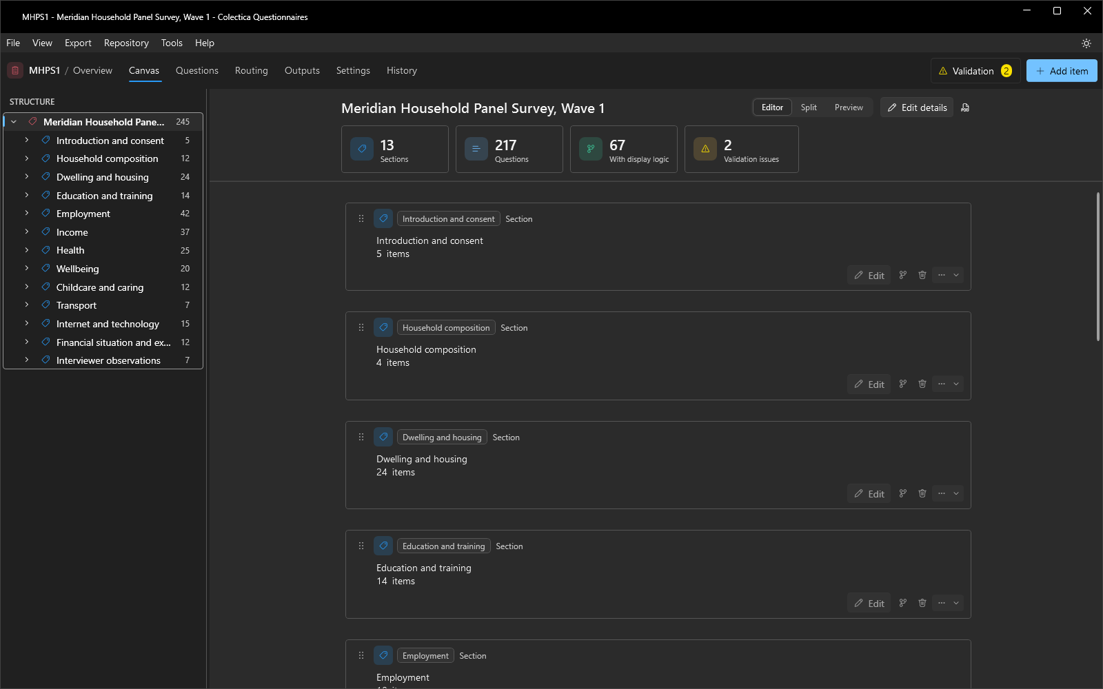
Selecting the survey root shows the overview: statistic cards for Sections, Questions, With display logic, and Validation issues, which counts the findings of the validation checks, followed by one card per top-level section.
The Section Header#
When a section is open, its header shows the section’s label, name chip, and description. If the section is conditional, a Display if chip summarizes the condition. The header also carries the Editor, Split, and Preview mode switch, a comment button, Edit details, a button that saves the section as a PDF, and a button that deletes the section.
Cards#
Every item in the open section is a card.
A card shows the item’s type icon, its name chip, its label chip, and its content, such as question text and a rendering of the response options.
A question card also carries the question’s number, Q1, Q2, and so on, in a pill at the left of its header.
The numbers are assigned automatically and follow the rule in Question Numbers.
Question text can be edited directly on the card; press Enter to commit or Esc to cancel.
Cards support the following actions.
Drag the handle on the left edge to reorder items.
Hover between two cards to reveal an Insert an item here band that opens the add-item palette at that position.
Edit opens the item’s full editor; see Question Editor and Item Editors.
The branch button adds or edits the item’s display logic; see Display Logic and Expressions.
The input indicator appears when the item consumes earlier answers and opens the Inputs dialog.
The comment button opens the item’s comment thread.
The delete button removes the item.
The overflow menu offers Remove Display Logic and Replace This Item With a Copy.
If an item carries a condition, a condition chip renders the rule on the card. Chip colors state the condition’s kind: green for a formal condition the application can evaluate, gray for a described condition, blue for native source code, and dark red for a broken condition.
When a newer version of an item exists in a repository, the card shows an Update available tag and becomes read-only until the item is updated.
The Live Preview#
The Editor, Split, and Preview switch controls the live preview pane. Split shows the editor and the preview side by side; Preview shows the preview alone.
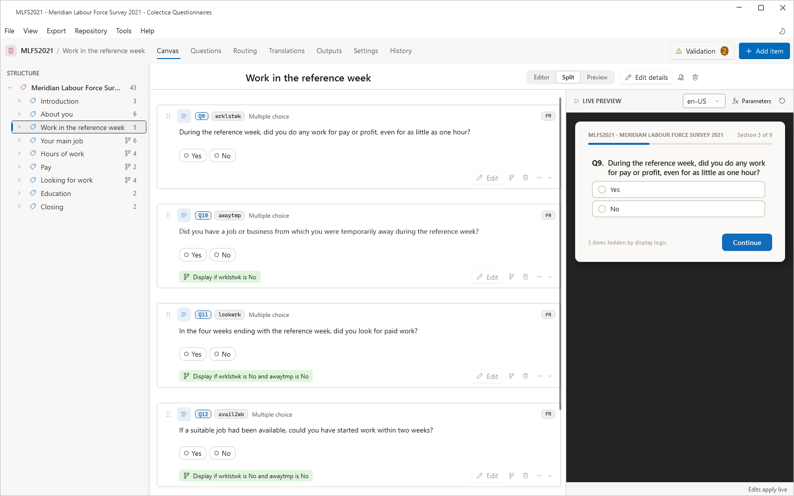
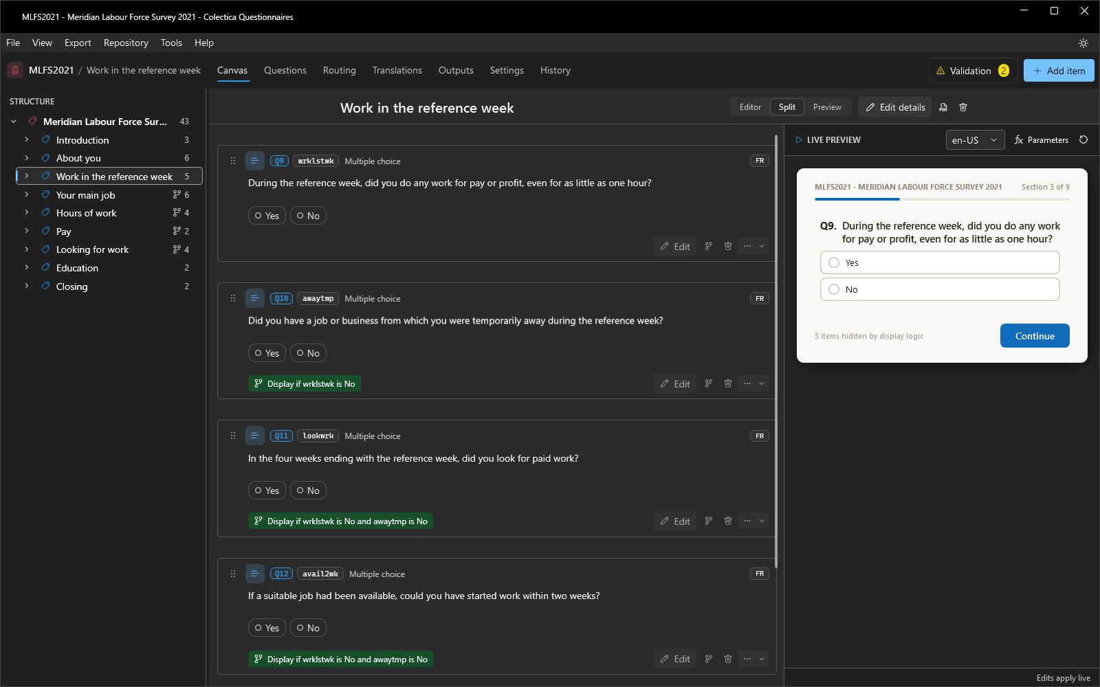
The preview renders the open section as a respondent would see it: a title, a progress bar, and answerable question blocks. Answers evaluate display logic, text fills, edit checks, and computations immediately, and they carry across sections for a whole run of the survey. The footer reads Edits apply live; canvas changes appear in the preview as soon as they are saved.
The preview header offers three controls.
A language dropdown, shown when the survey has more than one language, renders the preview in the chosen language with fallback to the default language.
Parameters opens a popover listing computed variables; a value can be pinned there to test logic without answering the source questions.
The restart button clears all answers.
Continue advances to the next section; the canvas follows. From the survey overview, Start preview begins a full run at the first section. Questions whose display logic references a Refused or Don’t Know operator show REF and DK chips so those states can be exercised. A footer note counts items currently hidden by display logic.
See also
For directions, see Add Questions and Content, Organize a Survey into Sections, and Test a Survey.